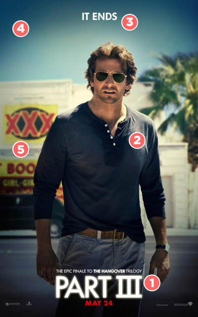
There’s been a lot said about the apparent half-arsedness of Warner Brothers’ marketing campaign for their big summer hope-pinner The Hangover Part III, which has so far consisted of a series of posters featuring hastily cropped production stills and sub-Instagram colour filters. Many have called the designs lazy, but if you ask me, they’re all part of a carefully orchestrated exercise in showboating. Allow me to elucidate…
 THE TITLE // Studio execs dream of developing franchises to the point where they can be evoked with little more than a logo (The Avengers), a commonplace word (Cars) or a silhouette (The Dark Knight). The team behind The Hangover have somehow managed to boil its brand down to a single typeface. And not just any typeface, but Futura — one of the most widely-used marketing fonts in the world, also found on the campaigns for Life of Pi, Chicago, The Social Network, The King’s Speech and countless other classy awards contenders. To boot, they’ve intentionally make the word ‘Hangover’ as minuscule as possible, eager as they are to prove that ‘Part III’ is really all that needs to be said.
 THE STAR // When the first Hangover movie was released in 2009, Bradley Cooper was best known for a minor supporting role in Wedding Crashers. Now he’s one of Hollywood’s most bankable leading men, has an Oscar nomination to his name, and is set to star in upcoming films from both Cameron Crowe and David O. Russell. Even then, his no-billing-necessary appearance on this poster is designed less to showcase Cooper’s fame, than the fame of his character within the film — Phil — whose dark sunglasses and artfully ruffled shirt have somehow become recognisable character traits over the course of two 90 minute comedies.
 THE TAGLINE // Again, what seems like rank incompetence — ‘It Ends’, seriously, that’s it? — can also be interpreted as chest-beating arrogance. After all, what other franchise could get away with such a banally utilitarian strap line? Even the final part of the Harry Potter series, the most successful film franchise of all time, had to slot an ‘All’ between those two words, which can only mean that The Hangover Part III is 50% more confident of its box office office chances than the fourth highest grossing film of all time.
 THE VIGNETTE // Vignetting is often used on movie posters to evoke a cinematic quality. Here, the reason is a little more pragmatic: the image of Bradley Cooper used on this design is nothing more than a run-of-the-mill production still, and without the filter he’d likely fade into the background along with the palm tree to his right and the theatre to his left.
 THE BACKGROUND // Posters for the previous two films in the series have focused on their famed locations — hedonistic Vegas, lawless Bangkok — and anarchic plot elements — the lost baby, the wild tiger, the face tattoo, and the monkey. Here, all you’re offered is an adult movie theatre and 3/5ths of the word ‘BOOBS’. Because let’s be honest: at this point, you’re going to see it wherever it’s set and whatever it’s about, aren’t you? AREN’T YOU?
On behalf of Warner Bros. Pictures, thank you in advance.